Choosing a splashback colour can feel simple at first, until you see how many options are available. How to Choose the Right Colour for Your Kitchen Glass Splashback is really about balancing style, light, practicality, and long-term value.
For homeowners and property owners across England, the right colour can make a kitchen feel brighter, larger, cleaner, and more finished. The wrong colour can clash with cabinets, date the space quickly, or make a small kitchen feel darker than it is.
In this guide, you’ll learn how to match your kitchen glass splashback with your worktops, cabinets, flooring, lighting, and wider home style. You’ll also see which colours work well in modern UK kitchens, traditional British kitchens, and open-plan spaces.
Why Colour Matters More Than You Think in a Modern Kitchen
A kitchen splashback is not just a practical panel behind the hob or sink. It sits at eye level, reflects light, and often runs across one of the most visible parts of the room. That means its colour has a strong effect on the overall look and feel of your kitchen.
A well-chosen coloured glass splashback can make a modest kitchen renovation feel more premium. It can also help tie together cabinets, flooring, handles, lighting, and appliances. In many British homes, where kitchens vary from compact terraces to open-plan extensions, colour can change how the room feels every day.
If you are planning new kitchen glass splashbacks, think beyond your favourite colour. Consider how the shade will work with natural light, artificial lighting, and the existing features in your home.
The Impact of Colour on Space and Light
Colour affects how spacious your kitchen feels. Light colours, such as soft white, pale grey, cream, and muted stone, reflect more light around the room. These shades often suit smaller kitchens, galley layouts, and homes with limited natural light.
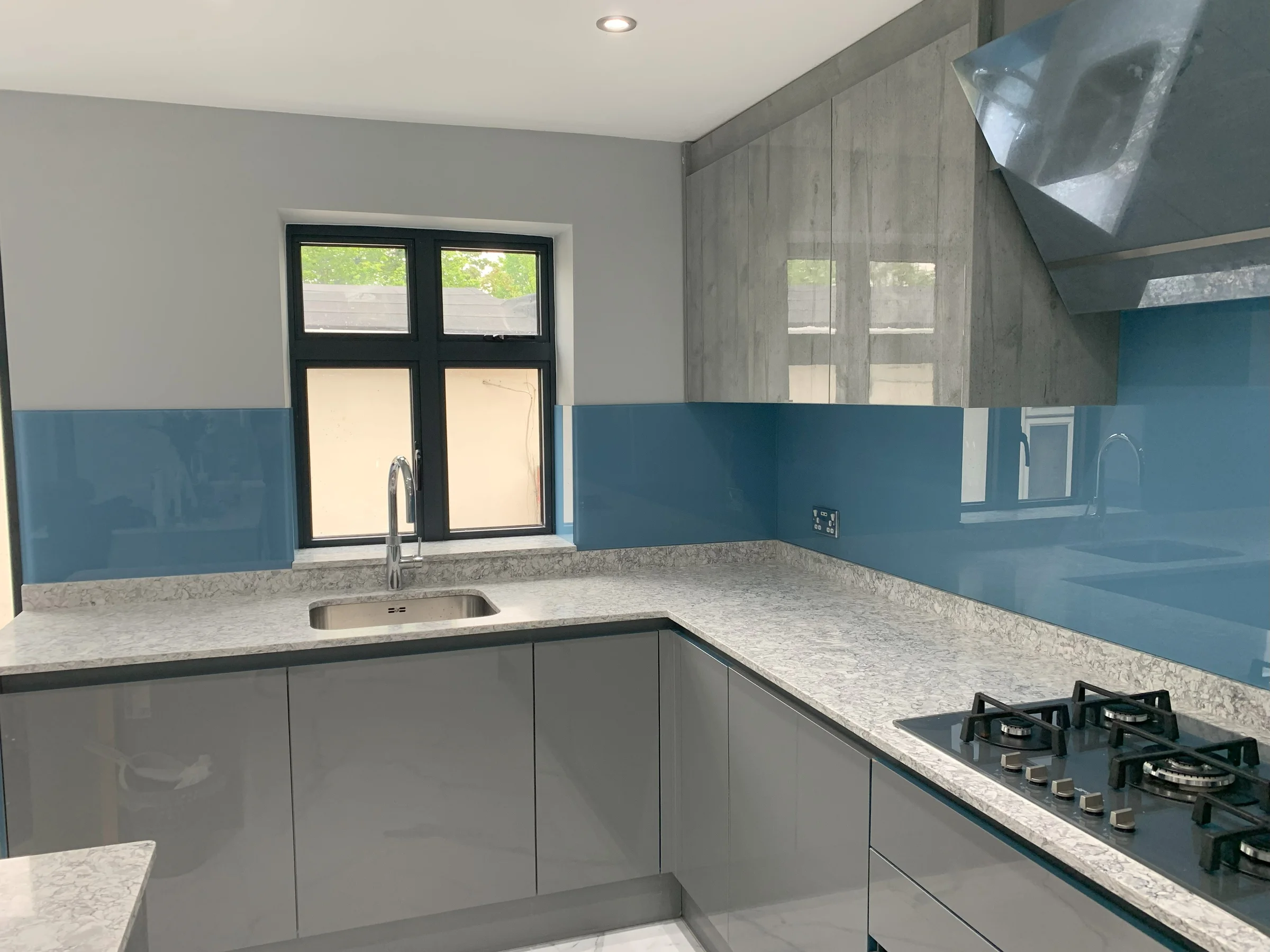
Darker colours, such as navy, charcoal, forest green, and black, can create a bold and luxurious effect. They work especially well in larger kitchens or rooms with strong natural light. However, if used in a small or shaded room, they may make the space feel enclosed.
Glossy glass kitchen panels also reflect light differently from painted walls or tiles. A toughened glass splashback can bounce both daylight and under-cabinet lighting back into the room. This is one reason glass wall panels are popular in modern kitchen design.
As a simple rule, use lighter colours to brighten and expand the space. Use darker colours when you want contrast, depth, or a strong design feature.
Matching Your Splashback with Existing Features
Your splashback colour should work with what is already in the kitchen. Start with the fixed features that are expensive or difficult to change, such as cabinets, worktops, flooring, and large appliances.
For example, if you have white shaker cabinets and oak worktops, a soft sage, warm grey, or classic cream splashback may feel balanced. If you have handleless dark cabinets and quartz worktops, a pale reflective splashback can soften the room and stop it feeling too heavy.
Look at the undertones too. Some whites feel cool and blue-based, while others feel warm and creamy. Mixing cool grey cabinets with a warm beige splashback can look slightly off, even if both colours are neutral.
When planning How to Choose the Right Colour for Your Kitchen Glass Splashback, compare colours against real surfaces in your own kitchen. A shade that looks perfect online may look very different beside your flooring or worktop.
How to Choose the Right Colour for Your Kitchen Glass Splashback
The best way to choose a splashback colour is to start with your kitchen style, then narrow the options by light, layout, and long-term appeal. This helps you avoid choosing a colour in isolation.
Think about the role you want the splashback to play. Should it blend in quietly, add contrast, or become the main design feature? Once you know the answer, choosing the right finish becomes much easier.
A bespoke approach also helps. With bespoke splashbacks, you can choose a colour and size that fits your kitchen precisely, rather than working around standard tile shapes or limited off-the-shelf options.
Contemporary Kitchens
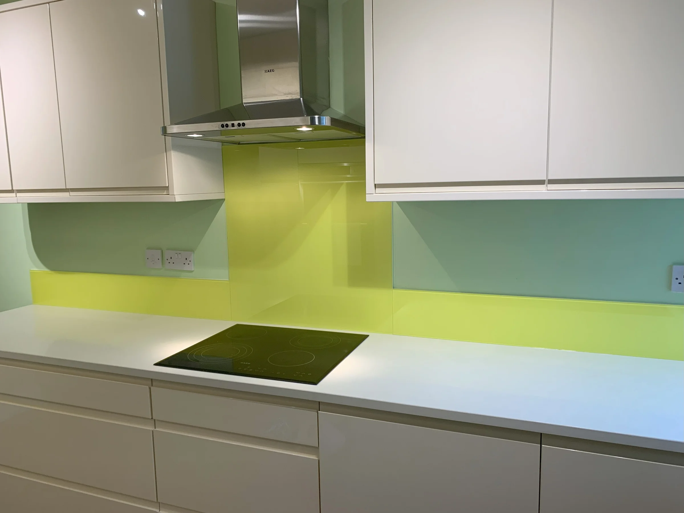
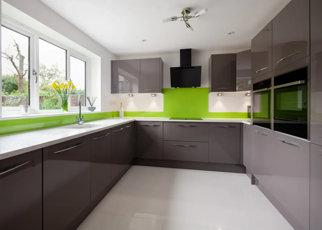
Contemporary kitchens often use clean lines, flat cabinet doors, integrated appliances, and simple finishes. In these spaces, the splashback colour should support the sleek look without adding clutter.
Popular choices include:
- White or off-white for a clean, bright finish
- Soft grey for a calm, modern feel
- Black or charcoal for bold contrast
- Muted blue or green for a softer designer look
- Metallic-inspired tones for a premium finish
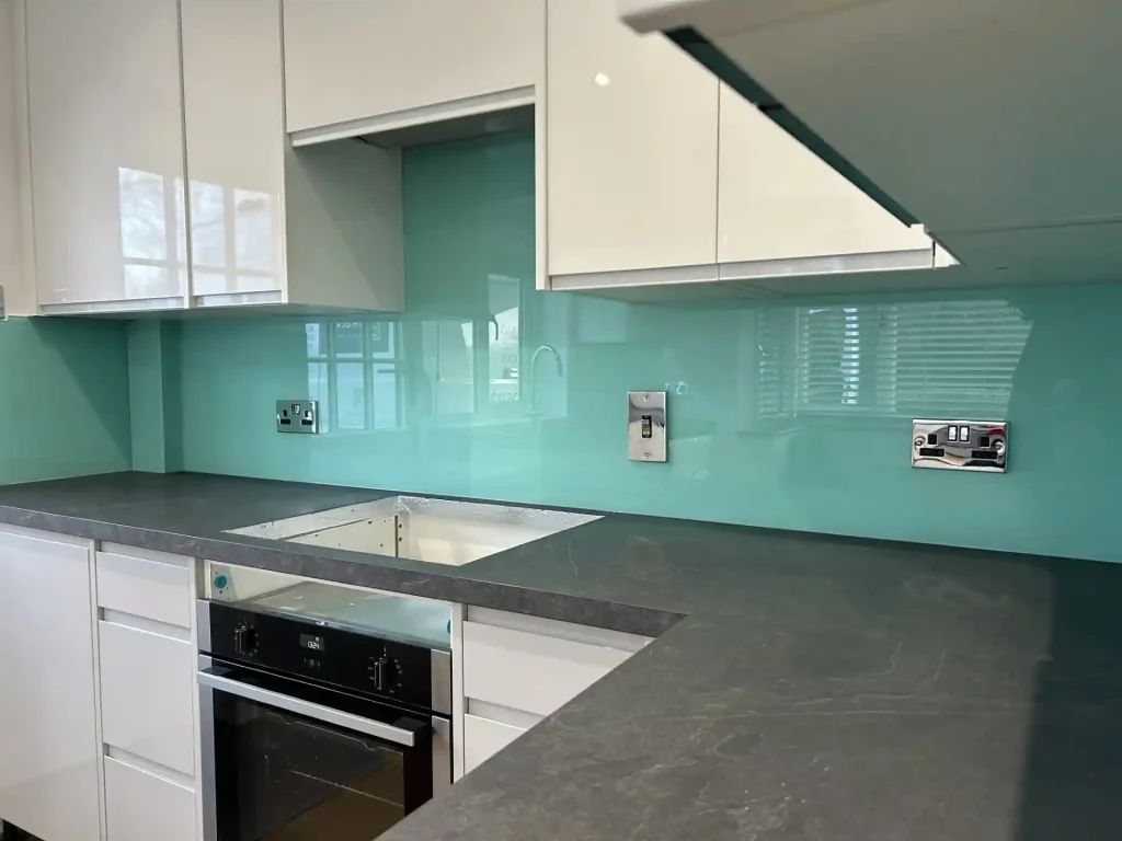
For contemporary kitchens with white or pale grey units, a bold coloured glass splashback can add personality without overwhelming the room. Navy, teal, bottle green, or deep red can work well when balanced with simple worktops and minimal accessories.
If your kitchen already has strong features, such as veined stone worktops or dark cabinets, choose a simpler splashback colour. This keeps the design from feeling too busy.
Traditional British Kitchens
Traditional British kitchens often include shaker cabinets, timber worktops, painted doors, Belfast sinks, brass handles, or period-style flooring. These kitchens usually suit softer, warmer colours rather than very stark shades.
Good options include cream, sage green, dove grey, duck egg blue, taupe, and soft white. These colours sit comfortably within many English property styles, from Victorian terraces to country cottages and Edwardian homes.
For How to Choose the Right Colour for Your Kitchen Glass Splashback in a traditional setting, ask whether the colour feels settled and timeless. A very bright or glossy shade may look out of place if the rest of the room has classic detailing.
That does not mean you have to avoid colour. A soft green splashback behind a range cooker can look elegant and practical. A warm grey panel can modernise the kitchen while still respecting the character of the home.
Open-Plan Kitchen Spaces
Open-plan kitchens need extra care because the splashback is visible from dining and living areas. The colour should work not only with kitchen units, but also with sofas, flooring, wall paint, and soft furnishings.
If the space is open and neutral, the splashback can act as a subtle link between zones. For example, a muted blue splashback may pick up tones from a rug or artwork in the living area. A warm taupe splashback may connect with timber floors and dining furniture.
In large open-plan rooms, bold colours can work well because there is more visual space around them. However, avoid choosing a shade that only suits the kitchen corner. You will see it from across the room, so it needs to feel part of the whole interior.
For open-plan modern UK kitchens, many homeowners choose custom glass splashbacks because they create a seamless, easy-clean finish without grout lines breaking up the view.
Popular Kitchen Glass Splashback Colours Across England
Kitchen colour schemes vary across England, but some splashback shades remain popular because they suit a wide range of British homes. The best choice depends on your property style, natural light, and whether you prefer a timeless or statement look.
Neutral colours are popular because they are flexible and easy to live with. Bold colours are chosen when homeowners want the splashback to become a design feature.
Neutral Colours That Never Go Out of Style
Neutral splashbacks are a safe and stylish choice for many homes. They work well with painted cabinets, wood finishes, stone worktops, and stainless-steel appliances.
Common neutral options include:
- White
- Warm white
- Cream
- Pale grey
- Dove grey
- Taupe
- Beige
- Soft stone
White and pale grey are especially useful in smaller kitchens because they reflect light and make the space feel cleaner. Warm neutrals suit traditional British kitchens where pure white may feel too harsh.
Neutral does not have to mean plain. Decorative glass splashbacks can include subtle tones, printed effects, or colour-backed glass for depth. A neutral toughened glass splashback can still feel polished and high-end, especially when fitted neatly around sockets and appliances.
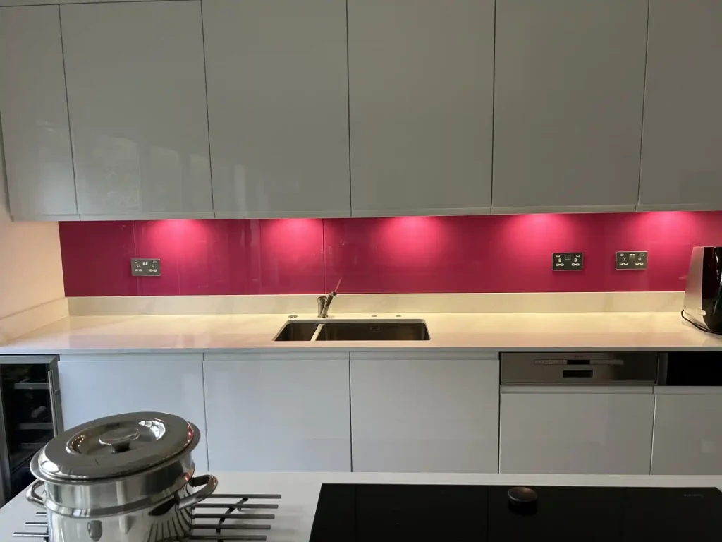
Bold Colours for Statement Kitchens
Bold splashback colours are ideal when you want energy, contrast, or a focal point. They work well in contemporary kitchens, extensions, and properties where the kitchen is a main social space.
Popular bold shades include:
- Deep blue
- Emerald or forest green
- Burnt orange
- Rich red
- Aubergine
- Black
- Charcoal
- Bright teal
A bold splashback works best when the surrounding finishes are controlled. For example, navy glass can look striking with white units and pale quartz. Emerald green can add warmth to dark wood or brass details.
If you are choosing coloured glass splashbacks, test how the colour looks in both daylight and evening light. Some strong colours look richer at night, while others may appear darker than expected.
Common Colour Selection Mistakes Homeowners Make
Choosing a splashback colour is easier when you know what to avoid. Many mistakes happen because homeowners make the decision too quickly or judge a colour in the wrong setting.
A kitchen glass splashback is built to last, so it is worth taking time over the details. Small decisions about undertone, lighting, and placement can make a big difference to the final result.
Choosing a Colour Only from a Sample
Samples are useful, but they do not show the full effect of a finished splashback. A small colour card or glass sample may look subtle in your hand, but much stronger when installed across a large wall area.
Always view samples vertically, not flat on a table. Hold them where the splashback will go, next to your worktop and beneath your cabinets. This gives you a more realistic view.
When thinking through How to Choose the Right Colour for Your Kitchen Glass Splashback, remember that scale changes colour. A deep red or black may feel dramatic on a small sample but overpowering across a long run of wall.
If you are unsure, choose a softer version of the colour you like. Muted tones are often easier to live with than very bright shades.
Ignoring Lighting Conditions
Lighting can completely change how a splashback colour looks. North-facing kitchens in England often receive cooler, softer light. South-facing kitchens tend to feel warmer and brighter.
Artificial lighting matters too. Warm white bulbs can make cream, beige, and taupe feel cosy, while cool white bulbs may make grey or blue tones appear sharper. Under-cabinet lighting can also intensify the shine and reflection of glass kitchen panels.
Check colours at different times of day. Look in the morning, afternoon, and evening with the lights on. This is especially important if your kitchen has few windows or shaded views.
A colour that looks perfect at midday may feel too dark at night. Practical testing helps you avoid that regret.
Following Trends Without Considering Long-Term Appeal
Trends can be inspiring, but they should not be the only reason you choose a splashback colour. A shade that looks exciting now may feel dated in a few years, especially if it is very bright or unusual.
This matters for property value too. If you plan to sell in the near future, a highly personal colour may not appeal to potential buyers. Neutral and softly coloured splashbacks often have wider appeal.
That said, your kitchen should still feel like your home. If you love bold colour, use it carefully. Pair it with simple cabinets and timeless worktops so the overall design remains balanced.
How to Choose the Right Colour for Your Kitchen Glass Splashback for Long-Term Value
Colour affects more than day-to-day style. It can also influence how buyers view your kitchen and how well the design ages. A good splashback should feel attractive now and still look considered several years later.
For UK homeowners investing in a kitchen renovation, this is important. Kitchens are one of the most closely judged rooms in a property, and buyers often notice whether the design feels clean, practical, and well maintained.
Future-Proof Colour Choices
Future-proof colours are usually easy to pair with other finishes. They do not rely too heavily on short-lived trends, and they work with a wide range of cabinet styles.
Good long-term choices include warm white, soft grey, pale stone, muted green, and deep navy. These colours can suit both modern and classic interiors, depending on how they are used.
If you want flexibility, choose a splashback colour that will still work if you repaint the walls or update cabinet handles later. This gives you more freedom to refresh the kitchen without replacing the glass.
For How to Choose the Right Colour for Your Kitchen Glass Splashback, long-term value often comes from balance. Choose something with enough character to improve the room, but not so much that it limits future design choices.
Colours That Appeal to Potential Buyers
If resale value is part of your decision, think about broad appeal. Buyers tend to respond well to kitchens that feel bright, clean, and easy to personalise.
Light neutrals, soft greys, and warm off-whites are safe choices because they help the kitchen look fresh. Muted greens and blues can also work well because they add interest without feeling too extreme.
Very bold shades can still add value if they suit the property and are finished to a high standard. For example, a deep green splashback in a stylish period home may feel intentional and premium. But a neon colour in a small flat may divide opinion.
A professional finish also matters. Neatly fitted splashbacks for kitchens can make the whole room feel more complete and easier to maintain.
Why Homeowners Across England Choose IM Glass
Homeowners across England choose glass splashbacks because they are practical, hygienic, and visually clean. They are especially useful behind hobs and sinks, where walls need protection from heat, splashes, and everyday cooking marks.
IM Glass works with homeowners and property owners who want made-to-measure glass products that suit their space. As experienced glass specialists, the team can help you consider colour, finish, measuring, and installation in a practical way.
Made-to-Measure Splashbacks
Made-to-measure splashbacks are cut to fit your kitchen layout. This is important because every kitchen has different socket positions, wall lengths, corners, cooker widths, and cabinet heights.
A made-to-measure approach gives a cleaner result than trying to adapt standard panels. It also helps avoid awkward gaps and unnecessary joins.
Bespoke glass wall panels are especially useful in older British homes, where walls may not be perfectly straight. A tailored fit helps the final splashback look neat and intentional.
Wide Colour Selection
A wide colour choice makes it easier to find a shade that suits your kitchen rather than settling for “close enough.” This matters because small differences in tone can affect the whole room.
You may need a warm white rather than a cool white, or a softer grey rather than a blue-based grey. You may also want a colour that matches a painted cabinet brand, a wall colour, or a specific design scheme.
With professional glass splashback solutions, you can explore options that suit both style and practicality. This helps you make a decision with more confidence.
Professional Installation
Professional installation helps your splashback look good and perform properly. Glass needs accurate measuring, safe handling, and careful fitting, especially around sockets, hobs, and edges.
A toughened glass splashback should be suitable for kitchen use and fitted with attention to detail. Poor measuring or fitting can spoil the look, even if the colour itself is right.
Using an experienced team for splashback installation also saves time and reduces stress. You get a finish that feels polished, secure, and designed for everyday use.
Frequently Asked Questions
What is the best colour for a kitchen glass splashback?
The best colour depends on your kitchen size, light, cabinets, worktops, and personal style. For smaller or darker kitchens, pale grey, warm white, cream, or soft stone can help reflect light and make the room feel larger.
For larger kitchens or open-plan spaces, deeper colours such as navy, green, charcoal, or black can create a strong feature. If you want a safe long-term choice, choose a colour that works with several possible wall colours and accessories.
How do I choose the right colour for my kitchen glass splashback if my kitchen receives little natural light?
If your kitchen receives little natural light, choose a splashback colour that reflects brightness rather than absorbs it. Soft white, warm cream, pale grey, light taupe, and gentle pastel tones usually work well.
Avoid very dark shades unless you have strong artificial lighting and want a dramatic look. Under-cabinet lighting can also help a glass splashback bounce light around the room. How to Choose the Right Colour for Your Kitchen Glass Splashback in a darker kitchen comes down to testing samples in your actual space at different times of day.
Should my splashback match my worktop or cabinets?
Your splashback does not need to match exactly, but it should coordinate. Matching can create a calm and seamless look, while contrast can add interest and depth.
If your worktop has a strong pattern, choose a simpler splashback colour. If your cabinets and worktops are plain, the splashback can carry more colour. Aim for one clear focal point so the kitchen does not feel too busy.
Are glass splashbacks suitable for traditional British kitchens?
Yes, glass splashbacks can work very well in traditional British kitchens when the colour is chosen carefully. Soft neutrals, sage green, duck egg blue, warm grey, and cream often suit classic cabinetry and period details.
Glass can also make a traditional kitchen easier to clean without removing its character. The key is to choose a colour that complements the style rather than clashes with it.
Will a bold splashback colour affect my property value?
A bold splashback can improve a kitchen if it looks intentional, well balanced, and professionally installed. Strong colours can make a kitchen memorable and stylish, especially in contemporary homes.
However, very unusual colours may not appeal to every buyer. If you plan to sell soon, consider muted or classic versions of bold shades. Deep blue, forest green, and charcoal often feel more timeless than very bright colours.
Final Thoughts
Choosing the right splashback colour is about more than picking a shade you like. You need to consider light, layout, cabinet colour, worktops, flooring, property style, and how long you plan to keep the design.
Light colours can brighten compact kitchens. Dark colours can add depth and drama. Neutral tones offer flexibility, while bold shades can create a striking feature when used with care.
How to Choose the Right Colour for Your Kitchen Glass Splashback comes down to balance: choose a colour that suits your home now, supports your wider kitchen design, and still feels right in years to come. Here are some tips to help you choose the perfect colour for your kitchen glass splashback:
Consider your property style: If you have a traditional or period home, you may want to opt for more classic colours like cream, grey, or sage green. For modern homes, bolder colours such as vibrant blues, reds, and greens can work well. Think about the overall colour scheme of your kitchen: Your splashback should complement the other elements in your kitchen, such as cabinets and countertops. Choosing a complementary colour will create a cohesive look.
Don’t be afraid to experiment with different shades and tones: You may find that a slightly lighter or darker shade of your chosen colour works